The Permanent Collection · The Future of Seeing Data
AI-Generated Visualization
Various (OpenAI, Anthropic, open-source community), 2023–present
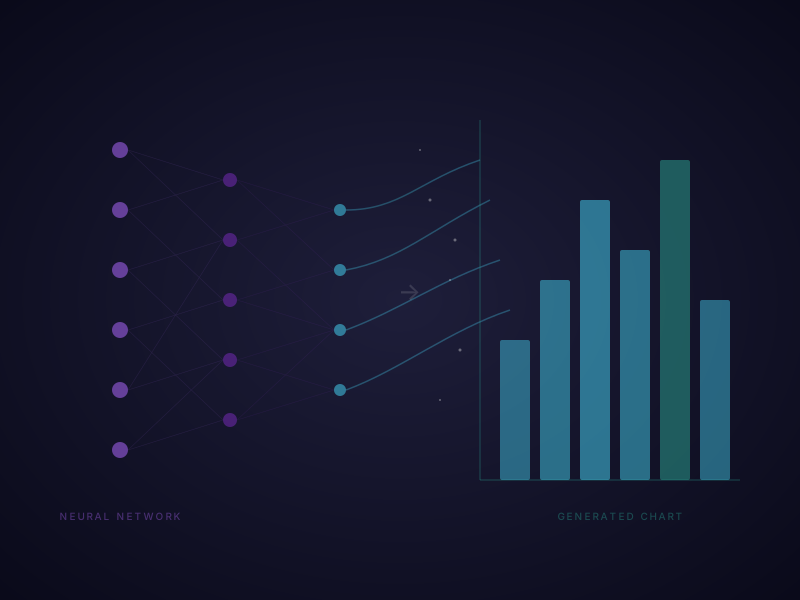
In 2023, the data visualization world crossed a threshold that had seemed decades away: people began generating charts, dashboards, and interactive visualizations by simply describing what they wanted in plain English. The catalyst was the rapid maturation of large language models — OpenAI's ChatGPT (with its Code Interpreter, later Advanced Data Analysis feature), Anthropic's Claude, and open-source models running locally — which could write Python, R, JavaScript, and D3.js code from natural language prompts, execute it, and return finished visualizations in seconds. A user could upload a CSV file and type 'show me the trend in sales by region as a grouped bar chart with error bars' and receive a polished matplotlib or Plotly figure within moments. GitHub Copilot and similar AI coding assistants further accelerated the trend by autocompleting visualization code as developers typed. The democratization potential is enormous: data visualization, which once required years of training in statistics and design, suddenly became accessible to anyone who could describe what they wanted to see. But the risks are equally significant. AI-generated charts can silently choose misleading scales, inappropriate chart types, or statistically unsound aggregations — and because the user may not understand the underlying code, they have no way to catch these errors. The black-box nature of LLM-generated visualizations means the reasoning behind every design choice is hidden. As the field grapples with this tension, researchers at institutions like MIT, Georgia Tech, and the University of Washington are working on frameworks for AI-assisted visualization that keep humans in the loop, ensuring that the person asking the question still understands — and can verify — the answer they receive.
AI · generative · future