The Permanent Collection · The Science of Visualization
Harry Beck's Tube Map
Harry Beck, 1933
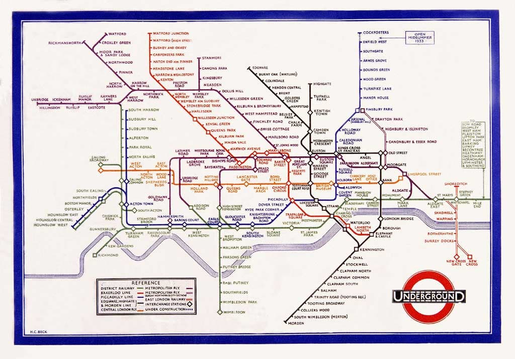
In 1933, a 29-year-old engineering draftsman named Harry Beck quietly revolutionized how cities see themselves — by throwing geography out the window. Working in his spare time while temporarily laid off from the London Underground Signals Office, Beck reimagined the tangled, geographically accurate Underground map as a clean topological diagram, using only horizontal, vertical, and 45-degree diagonal lines to connect stations. The result looked more like an electrical circuit diagram than a map, which made sense given Beck's background. When he first submitted his design in 1931, London Underground's publicity department rejected it as too radical — passengers, they worried, would be confused by a map that bore no resemblance to the actual geography above their heads. But Beck persisted, and a small trial printing in 1933 was an instant hit with riders, who found it vastly easier to navigate than any previous map. Within months it became the official map. Today, virtually every transit system in the world — from the New York subway to the Tokyo Metro — uses Beck's topological approach. His key insight was profound: when you're underground, you don't care where you are geographically, you only care about connections, sequences, and interchanges. By stripping away irrelevant geographic detail and emphasizing the information riders actually needed, Beck created what is arguably the most imitated information design of the twentieth century.
transit map · topological · London Underground · information design · diagram