The Permanent Collection · The Visualization Explosion
Hans Rosling's TED Talk and Gapminder
Hans Rosling, 2006
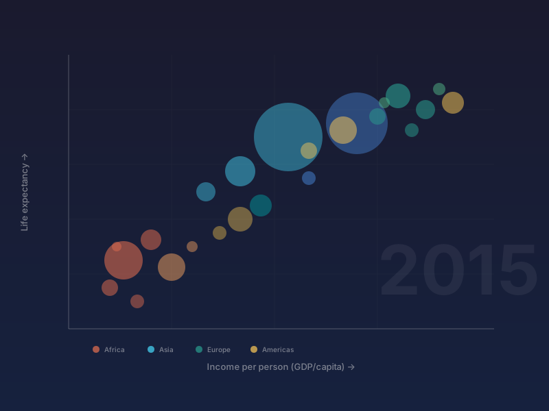
In February 2006, a 57-year-old Swedish professor of global health named Hans Rosling walked onto the TED stage and delivered what would become one of the most-watched TED talks of all time — 'The best stats you've ever seen.' Armed with animated bubble charts that plotted every country in the world across axes of income and life expectancy, Rosling narrated 200 years of global development in four breathless minutes, his pointer chasing China and India as they leapfrogged across the screen. The audience gasped. The bubbles moved, split, and merged as decades flew by, turning dry UN statistics into a vivid, emotional story of human progress. The talk has been viewed more than 15 million times and is widely credited with proving that data visualization, combined with passionate storytelling, can fundamentally change how people understand the world. Rosling had been developing the underlying software since 2005 through Gapminder, a Swedish foundation he co-founded with his son Ola Rosling and daughter-in-law Anna Rosling Rönnlund. Google acquired the Trendalyzer software from Gapminder in 2007 and integrated it into Google Public Data Explorer. Rosling continued evangelizing data literacy until his death in 2017, leaving behind a legacy that proved statistics don't have to be boring — they just need the right storyteller.
TED talk · bubble chart · global health · animated · storytelling