The Permanent Collection · The Pioneers of Modern Graphics
Minard's Map of Napoleon's Russian Campaign
Charles Joseph Minard, 1869
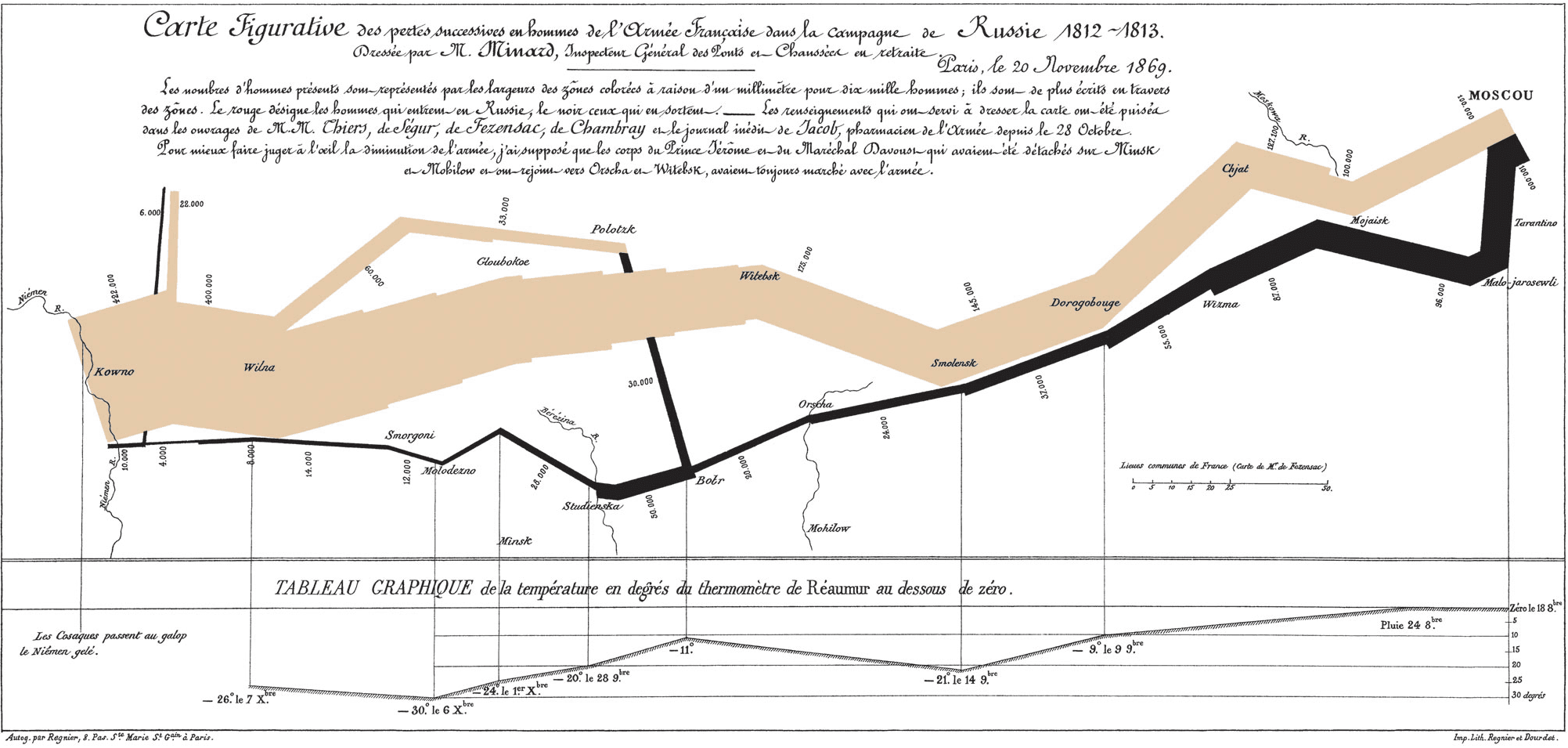
In 1869, a retired French civil engineer named Charles Joseph Minard — then 80 years old — sat down and created what many consider the greatest statistical graphic ever drawn. His flow map of Napoleon's disastrous 1812 Russian campaign tells a devastating story in a single image, weaving together six types of data simultaneously: the size of the army, its geographic location, the direction of movement, the dates of key events, the temperature during the brutal winter retreat, and the major river crossings. A thick tan band representing 422,000 soldiers narrows relentlessly as the army marches toward Moscow, then a thin black band — now just 10,000 survivors — traces the harrowing return through temperatures that plunged to -30°C. Edward Tufte, the renowned information design theorist, famously called it 'the best statistical graphic ever drawn,' praising its ability to tell a rich, complex, multivariate story with absolute clarity and emotional power. What makes Minard's achievement even more remarkable is its restraint — there's no clutter, no decoration, no unnecessary detail. Every mark on the page encodes data. It remains a masterclass in how visual design can make numbers speak with a human voice.
flow map · Napoleon · multivariate · military · Tufte