The Permanent Collection · The Origins of Data Visualization
The Commercial and Political Atlas
William Playfair, 1786
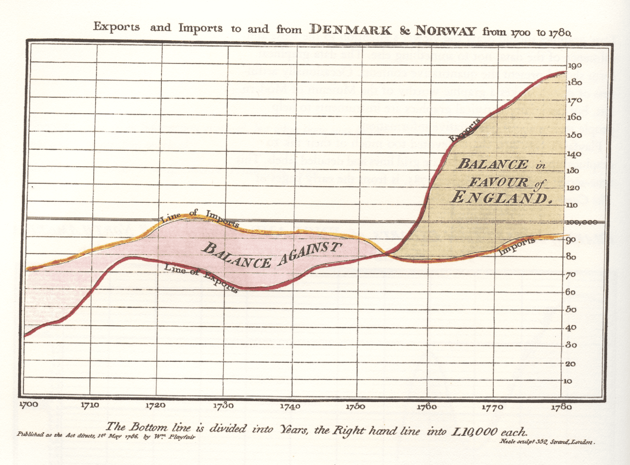
Here's a story that will change how you look at every chart you've ever seen. William Playfair, born in Scotland in 1759, trained as an engineer under none other than James Watt — yes, the steam engine guy — and somewhere along the way he got obsessed with the idea that numbers could be turned into pictures. In 1786 he published The Commercial and Political Atlas, and packed into that single book were 43 time-series line charts tracking England's trade over time, plus one oddball chart showing Scotland's trade with 17 different countries using horizontal bars — making it the very first bar chart ever created. But he wasn't done: in 1801 he dropped the Statistical Breviary, which casually introduced both the pie chart and the circle chart to the world. Think about that for a second — this one person invented three of the four most common chart types we use today, and most people have never heard of him. That's because the statistical establishment of his era was deeply skeptical; they trusted tables and raw numbers and thought his graphical inventions were flashy but unserious. Playfair died in 1823 without much recognition, and it wasn't until the 20th century that historians and statisticians finally realized his genius had been hiding in plain sight all along.
line chart · economics · trade · statistical graphics · pioneer